|
Lead Product Designer. 2024-2025. Led the creation of the design system at Moxe Health.
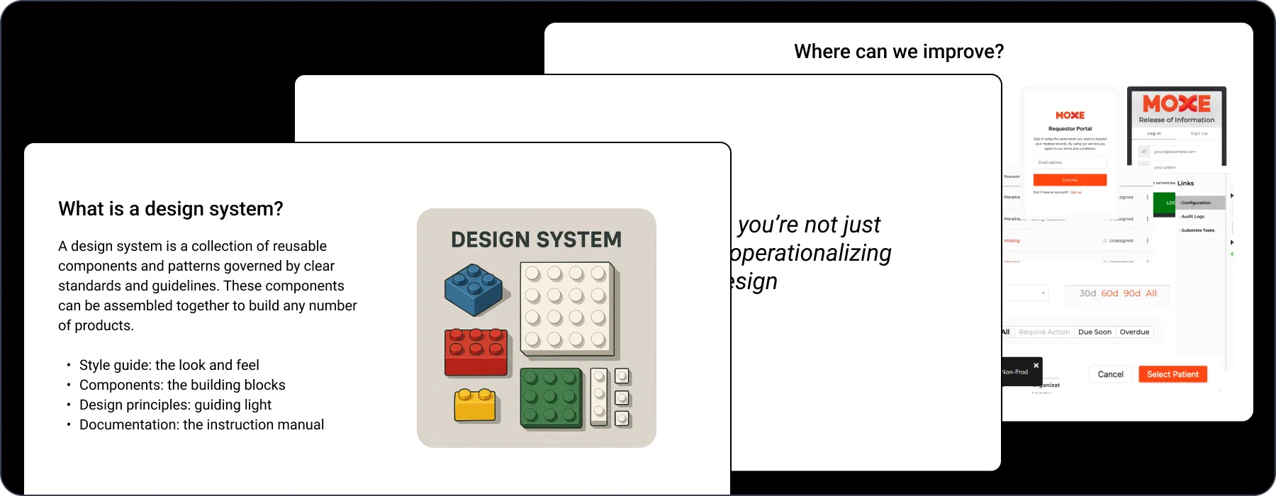
The Opportunity
As Moxe Health scaled, so did its product complexity. Three core platforms: Release of Information, Point of Care, and Config Service were growing in parallel, each developed by separate teams with their own design and engineering patterns. With no shared system, teams repeatedly recreated buttons, inputs, layouts, and patterns across codebases. It wasn’t just a developer issue; designers were duplicating efforts in Figma, tailoring inconsistent components for each product line.
The result? Slower product and development cycles, fractured user experiences, and compounding technical and design debt.
The Goal
We asked a simple but important question:
How might we...standardize our design and engineering components to improve consistency, increase development velocity, and reduce duplicate work?
I pitched the vision for a unified design system to our Chief Product Officer, highlighting the growing costs of fragmentation. With leadership support, we green-lit the project, and Particle was born.
Our Approach
To build a system that worked across teams and products, I formed a cross-functional working group. I led product and design, working alongside one other designer, a lead front-end engineer, and two supporting engineers, each representing different product lines. Our goal: create a shared foundation for UI design and implementation across Moxe.
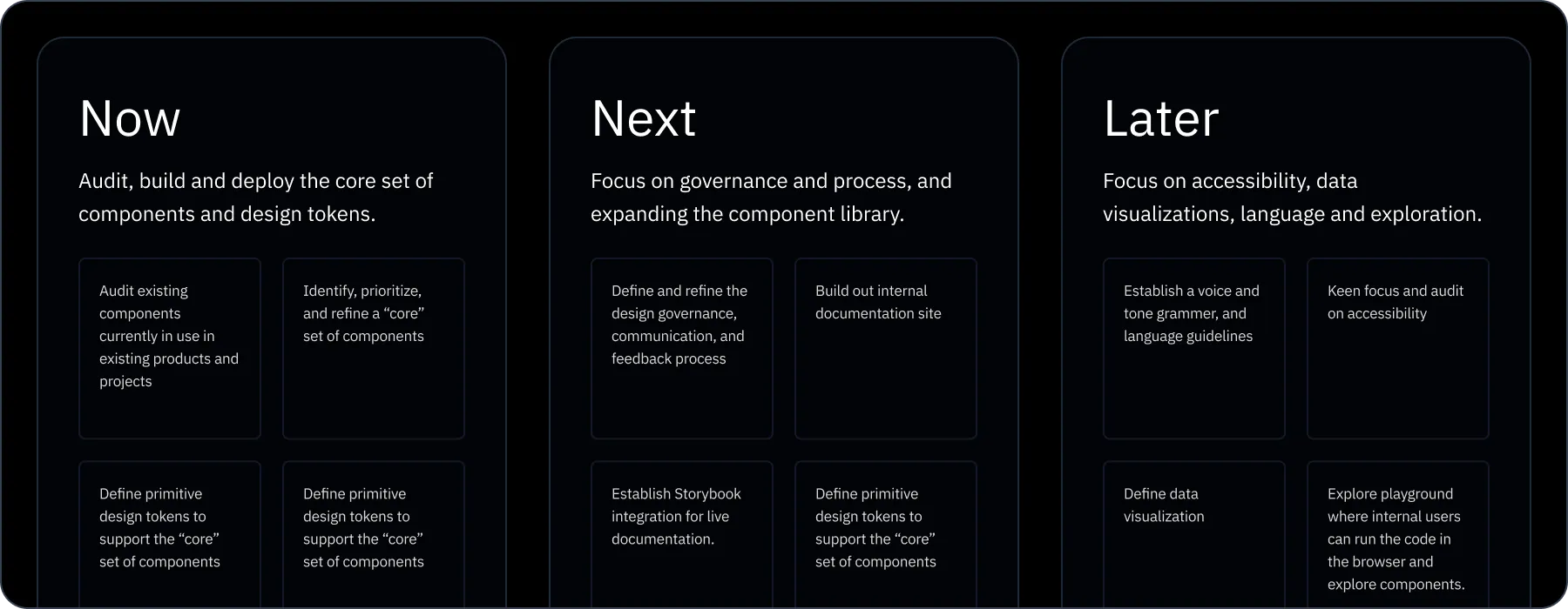
We mapped our efforts using a simple Now / Next / Later roadmap that helped us stay focused, ship what mattered most, and lay the groundwork for what’s ahead. It gave us enough structure to move with purpose, while staying flexible as priorities shifted and we ramped up the system.
Now: Establishing the Foundation
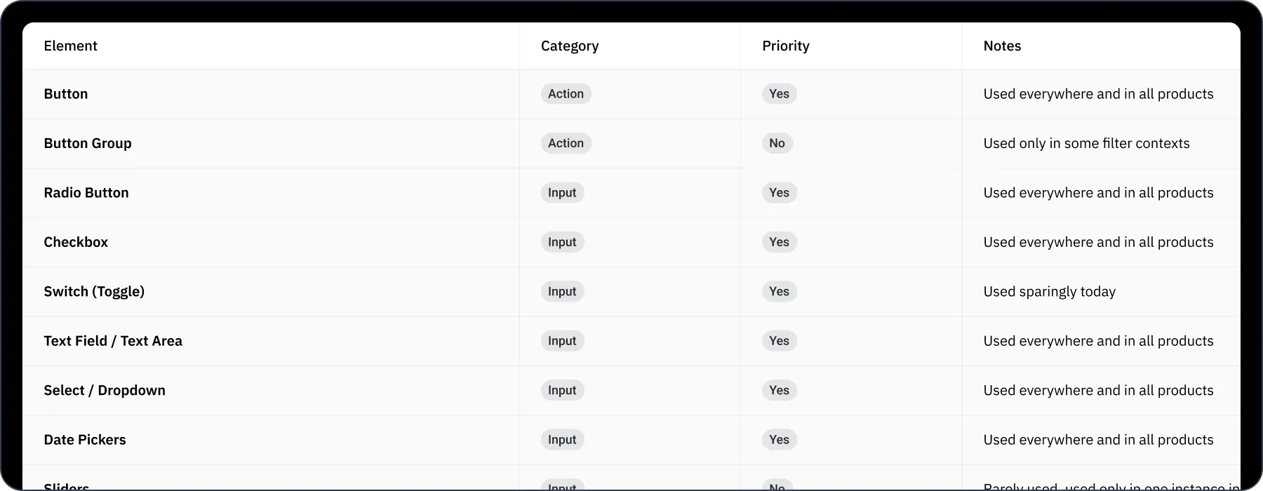
Auditing What Already Exists
We started with a full audit of our existing UI. Every component used in production across all platforms was indexed in a shared spreadsheet: buttons, inputs, modals, forms. We tagged them by priority and category and worked directly with engineers to validate what was being reused, what was redundant, and what was broken.
Defining the Core Primitives
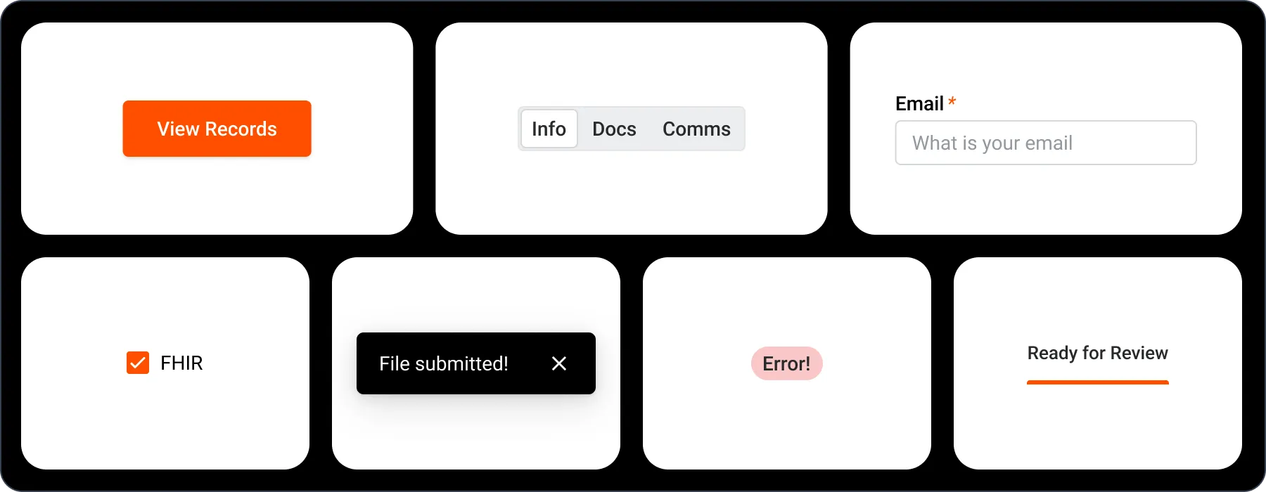
We narrowed our focus to the highest leverage elements. These were components used repeatedly across products, such as buttons, typography, forms, and alerts. Our goal was to get alignment on the smallest building blocks before moving up the component tree.
We held working sessions with engineers from each product team to pressure-test assumptions and learn what was actually being reused. This helped us avoid building a system in a vacuum.
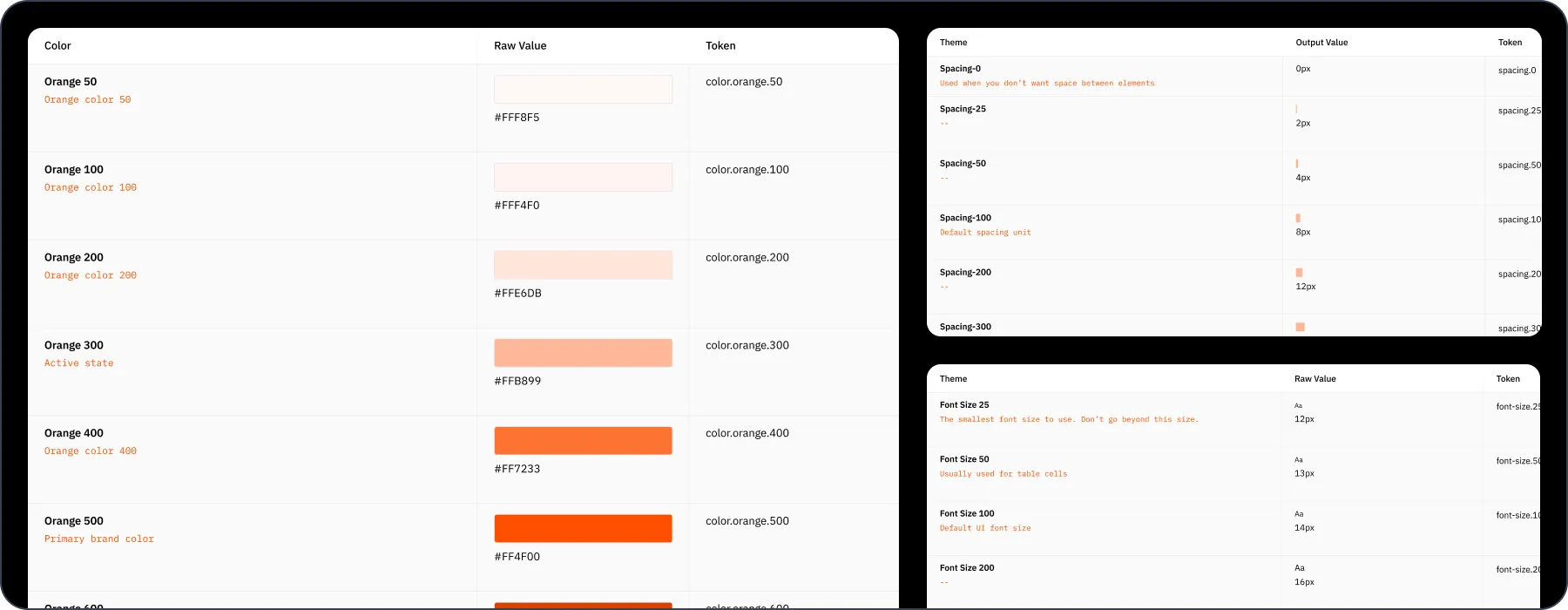
Introducing Design Tokens
One of the core problems was styling inconsistency. Engineers often hardcoded values like padding, colors, and radii. This was compounded by the mix of CSS methodologies (Tailwind, styled-components, vanilla CSS) across projects.
We introduced design tokens to solve for this. Tokens provided a centralized, semantic naming structure for core values like color, spacing, typography, and radius. These tokens became the connective tissue between Figma and code.
Next: Scaling the System
Defining Governance
Design systems fail without clear governance. We created a lightweight but structured 3-step process to handle requests, propose changes, and approve new additions. This ensured consistency while keeping the system flexible and responsive to team needs.
Changes moved through the following stages:
Propose → Review → Implement
- Propose: Any team member (designer, engineer, or PM) could submit a proposal for a new component, update, or guideline using a shared intake form. This captured the problem, proposed solution, and relevant context like use cases or affected products.
- Review: A cross-functional working group met bi-weekly to review proposals. We evaluated each request against our core design principles, reuse potential, and level of effort. If the idea aligned with our goals, we added it to the roadmap. If not, we provided clear rationale and suggestions for alternatives.
- Implement: Once approved, designers and engineers worked together to build the change. Designers led Figma updates and usage documentation, while engineers implemented the update in code. Every new component required documentation and review from a team outside the original proposer to ensure it worked across use cases.
Governance wasn’t about gate keeping, it was about shared ownership and clarity, giving everyone at Moxe a voice in how the system grew.
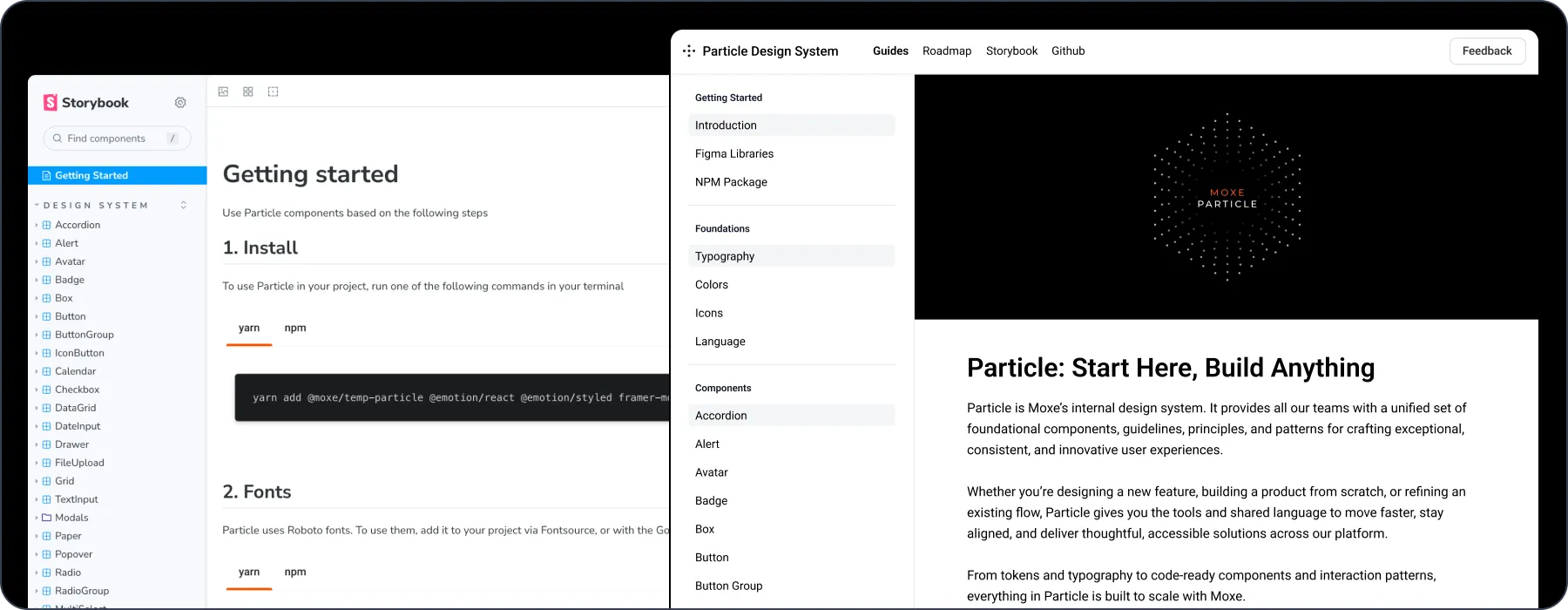
Building the Documentation Site
To increase visibility and adoption, we built an internal documentation site that housed everything:
- Our design principles
- A component explorer powered by Storybook
- Usage guidelines for both designers and developers
We also added multiple feedback loops. A feedback form lived directly on the site, giving teams a quick way to submit ideas, report issues, or request changes. Every submission fed into our governance process for review and follow-up.
To support transparency, we kept a working changelog and public roadmap on the site. Anyone at Moxe could see what had shipped, what was in progress, and what was coming next. That visibility helped build trust and made it easier for teams to get involved early.
This wasn’t just a wiki. It became the front door to the design system: accessible, evolving, and deeply integrated into how teams built product.
Selling the Vision Internally
While leadership had bought in early, we needed the entire company to understand the value of the system. During a company-wide all-hands, I presented the vision behind Particle, why we built it, how it worked, and what it enabled.
We framed it as democratizing design across the organization. The reception was overwhelmingly positive. Teams saw it not just as a design tool, but a way to work faster and smarter.
Later: Evolving the System
Rolling out to legacy products
We aimed to gradually replace legacy UI libraries like Material UI by introducing Particle components one layer at a time. Starting with foundational elements such as buttons, form inputs, and layout primitives, we focused on smaller wins that could be adopted without massive rewrites. This approach gave teams the flexibility to modernize at their own pace while moving toward a unified system.
Expanding our language system
Beyond visual design, we recognized language as a critical piece of the user experience. We planned to partner with our internal content and marketing teams to define a shared voice and tone across all surfaces. Whether users were reading helper text, labels, or tooltips, the goal was to ensure every word felt deliberate, consistent, and aligned with Moxe’s values.
Deepening our accessibility work
Accessibility was built into the foundation of Particle, but we knew we had more work to do. We aimed to go beyond minimum standards by strengthening support for screen readers, keyboard navigation, and motion reduction. Long term, we also intended to bring in feedback from our healthcare partners to help prioritize accessibility features based on real-world needs.
Real-World Testing: Point of Care Redesign
The first big test was a full rebuild of our Point of Care platform. With a modern tech stack, it was the perfect sandbox to implement Particle end to end.
The results were immediate: faster iterations, fewer handoff issues, and a cleaner, more cohesive UI. Engineers could ship UI faster, and designers didn’t have to reinvent the wheel with every mockup.
What We Learned
- Start small, scale with intent. You don’t need to build everything up front. Focus on high-impact components and evolve from there.
- Design systems are products. Treat them with the same care: road maps, feedback loops, adoption metrics.
- Documentation is everything. A well-documented system removes friction and empowers everyone to move faster.
- Design systems are never done. Keep listening, iterating, and improving.
- Selling the story matters. Without internal buy-in, even the best systems go unused.